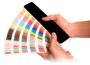
Secrets of Color

Adding color to your printed pieces is a proven, effective way to catch attention and deliver a powerful message. Here are a variety of things to consider when it comes to color:
• Pantone colors in desktop software are not always the same. Always check the built-in percentages.
• Never trust the color on the monitor. It is always best to use the color values and percentages.
• Fluorescent and metallic colors cannot be achieved using four-color process printing. Instead, you must use a spot color.
• Pure violets, greens, and oranges are very difficult to match using four-color process printing. To achieve vibrant colors, a fifth spot color or six-color, high-fidelity printing can be used.
• When doing gradient blends (vignettes), it’s common for “banding” to occur. Banding is the visible lines between the color changes in the gradient. To help eliminate banding, limit the change in a color to no more than 75% from end to end. For example, instead of going from 0% cyan to 100% cyan, start at 10% and end at 80%. If you are using PhotoShop to create the gradient, try adding a pixel or two of noise from the noise filter.
There are so many things to consider when you are producing a printed piece, and color is definitely one of the most important. Please ask us any questions you may have about effectively using color for your printed pieces.
